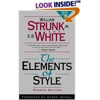
Putting the Strunk Back in Strunk and White
Minimalist design for websites ..."In web design screeds, the most commonly cited book is not what you might expect. It is not by Jakob Neilson or Jeffery Zeldman or Edward Tufte. It's not even on design or typography or code. It is a thin volume of guidelines on writing by a professor at the closing of the first world war and treasured by one student enough to put it into print.
William Strunk was the professor, and E.B. White, author of Charlotte's Web, was that grateful student. White took the master's set of laws, removed some bewhiskered entries, corrected some errors, and added his own chapter at the end for those who feel English prose composition is not only a necessary skill but a sensible pursuit as well.
The most common excerpt from the book is one from Strunk, quoted as much for its poetry as its proposition:"Vigorous writing is concise. A sentence should contain no unnecessary words, a paragraph no unnecessary sentences, for the same reason that a drawing should have no unnecessary lines and a machine no unnecessary parts."
This concept seems to have permeated the design community's collective mind. Minimalist websites eschewing borders, decorative graphics, and even color abound. The book's principles are often held up to praise Google or damn eBay. But is anyone reading Strunk and White, or are they simply taking away quotes they like, and leaving the rest of the movie on the cutting room floor? There is a richness in the entirety of the text, which ranges from rules of grammar to approaches to structure, to even the heart of design: personal style." continued ... (Via Boxes and Arrows) (Usernomics). [Usability In The News]
Below is a link to the Amazon.com page for the book. Happy reading! It's a classic.
http://www.amazon.com/gp/product/020530902X/sr=8-1/qid=1152320606/ref=pd_bbs_1/104-3515275-1602365?ie=UTF8

0 Comments:
Post a Comment
<< Home